In which a guy old enough to know better talks about...stuff.
Including, but not necessarily limited to: Wrestling, Metal, Anime, Books, Comics, Cartoons, Stuff that pisses me off, AOR and songs with "Metal" in the title.
Ihaven't done a Cover Girls post in a while - not since March, in fact - and since my album folder is bulging at the seams, I thought I'd better rattle one off quick. However this will not be the usual format; which is where I post a bunch of covers on a theme and attempt to be witty.
No, the only things connecting these covers are that 1. they have a woman on it and 2. they could easily feature on Terrible Metal Album Covers instead. This might be down to a dodgy theme, poor composition or a general lack of artistic...anything. See what you think.
Ted Nugent - Love Grenade (USA 2007)
Ok, so the artist can draw but while this might be an attempt at a "playful" old-fashioned pinup, it just comes across as tacky.
Perpetual Rage - Empress Of The Cold Stars (Finland 2017)
You can sort of see what they were going for - an Indie comics vibe - but don't quite pull it off.
The next band are more prog than metal but while I'm here...
Forest Field - Angels (NLD 2015)
Whereas this one is trying for an anime style and while it would look great on a hentai, is it really doing the band any favours?
I haven't done one of these in a while and since I have a few covers left to use, what the hell.
The objective is to demonstrate what can go wrong when the artistic vision of the band runs headfirst into the artistic ability of the artist and the result is a steaming pile of disaster, leaking fluids and the bitter stench of failure.
Please note: Just because the cover is a badly drawn mess does not mean that the band suck. Artists like Iron Maiden, Black Sabbath, Helloween and Metal Church have all had utter catastrophes plastered on the front of their albums.
Now let's dive in.
Achesete -Manicomio Sin Techo (Spain 2017)
What the fuck is wrong with his face?
Why would anybody choose this mutation to represent their band?
Eezee - Matter Of Attitude (Australia 1993)
The band tries to create their own mascot a la Vic Rattlehead and almost manage to pull it off.
Zephaniah - Stories From The Book of Metal (USA 2006)
Full marks for being ambitious but the end result is, to put it mildly, not pretty
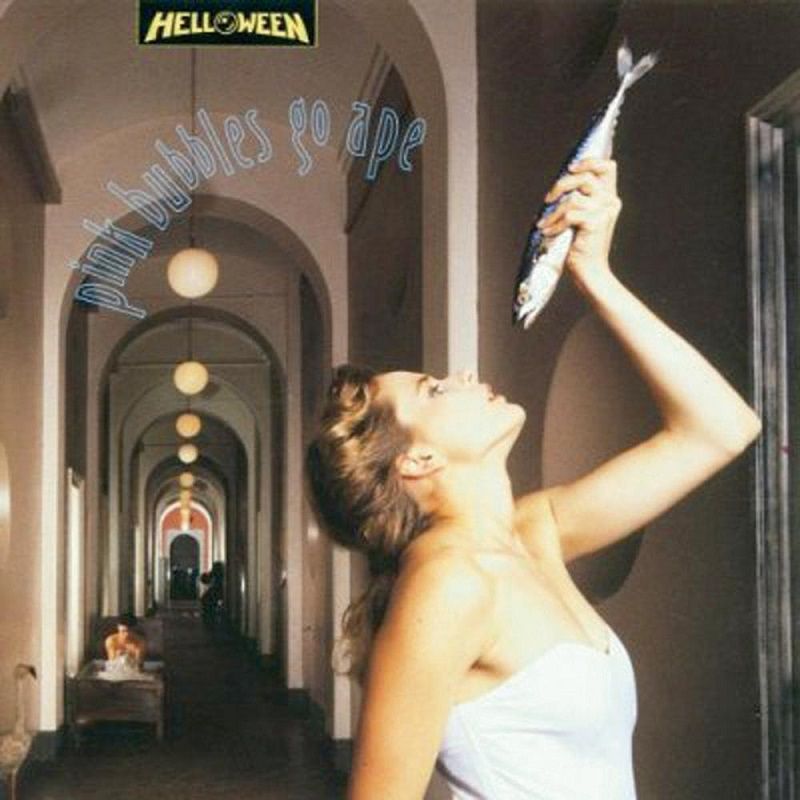
Helloween - Pink Bubbles Go Ape (Germany 1991)
A well-respected band, a major label and a decent budget all combine to create this.
I honestly don't know what Helloween were trying to do, besides highlight how "Wacky" they were.
Good job, boys. Good job.
Impulse - Gladiator - (Bulgaria 1989)
having a musclebound warrior on your cover worked well for Manowar.
Sadly this Bulgaran band decided their guy needed NHS Librarian specs.
Hello and how has your weekend been? Mine's been mostly OK although I really wish the seagulls that have been squawking non-stop since 4AM would pack up and sod off to somewhere far away from me.
Tell you what. Let's have a look at some album covers that are a bit shite, shall we?
Some bands have a good concept but do it badly, some have a bad concept and do it really badly and some just threw a handful of crayons at the wall and used the result. I leave it to you to decide which is which.
Before we go any further I'd like to issue my usual disclaimer.
Bad cover does not equal bad band.
Now read on.
Chaos Injected - S/T 2016
There's a man surfing in a toilet.
That's the not even the most bizarre thing about this cover.
Ho Boy.
Roctum - Nothing To Do With Hell EP (Finland 2017)
These Finns make it perfectly clear that they aren't Satanic.
Still not exactly people you'd invite around for milk and cookies though.
They seem entirely too keen on stabbing dudes for my liking.
Demon - Blow-Out (UK 1992)
Question: If you didn't know this band, what do you think they'd sound like based on this album cover?
Dodgy Teutonic Speed Metal?
Raucous South American Thrash?
Here's a perfect example of a band being let down by their artwork because this Staffordshire
crew have been delivering sophisticated, intelligent hard rock since 1980 and
sound more like Magnum than whatever mental image that cover brought up.
Great band.
Terrible cover.
Dark - Sex N Death (Cz. Rep. 1992)
So what does this cover have to do with "Sex", exactly?
Dark have a song called "Sex Shop of Doctor Fuctor" which amuses me more than it should.
Harrow - The Pylon Of Insanity (NLD 1994)
The pylons are apparently made of turds so that's pretty insane.
Sticking with giant-ass eyes...
Dizziness - On The Rocks (Sweden 2013)
The artist is trying to be clever, isn't he?
He also seems to think it's still 1984.
Dawn Hawk -S/T (1990)
I'm going to have nightmares about giant, clutching pink claws tonight, I just know it.
Time for me to go shout at some seagulls so I'll knock it on the head.
I got a bit of a shock when I opened up my Blogger page today and discovered that I'd had a months worth of page views in a day, courtesy of http://www.metafilter.com/ and http://dangerousminds.net/ pointing people in the direction of Terrible Metal Album Covers.
I think the Internet is trying to tell me something.
So here we go with another batch of album covers that are never going to be in any coffee-table books. Not unless the title includes the words "Shite", "Wank" or "Drawn by a chimp" at any rate.
Please note that Terrible album cover ≠ Terrible band.
I haven't done one of these in a while so what the hell, here's a selection of album covers that have bad ideas, bad execution and occasionally bad use of fonts as well.
I do have one disclaimer though. Just because the cover is terrible does not mean the band suck.
Remember that Black Sabbath, Iron Maiden, Riot, Fates Warning and a host of other great bands all put out CDs with covers offensive to the eyes.
Now read on.
Profanator - Libido Clerico
I only just realised that she's supposed to a metal version of The Virgin Mary
Even before that I just thought this cover was tacky as hell
I haven't done one of these for a while. In fact, I haven't done a TMAC since March 2014.
So this latest collection is more than overdue.
As always, I should emphasise that just because the album art is horrible to behold, utterly lacking in artistic merit and more than a bit silly, does not mean the band are also terrible.
Shall we begin?
Daniele Liverani - Fantasia (Italy 2014)
Mr Liverani is by all accounts a talented chap - multi-instrumentalist, producer and composer.
So he really deserves something a bit better than this.
It literally looks like he's been cut 'n'pasted into a generic bit of "Dream" artwork.
Motor- S/T (Germany 2013)
"Bat Out Of Hell" - The Tesco Value version.
God, this is ugly.
Funeral Frost - Queen of Frost (Sweden 1996)
This was always going to be a bit dodgy but the back-of-an-exercise-book art quality
just adds the icing on the cake. Then licks it off, drops the cake on the floor and kicks it around for a bit.
Jester - Tales From The Boogieman (USA 1996)
Not what I picture when I see the word Boogieman.
I usually tend to think of something a bit scarier.
Like this.
Admit it, if this guy lived under your bed you'd move house.
Not something that looks like a cross between a scarecrow and a mime.
Narcotic Greed - Fatal (Japan 1994)
So we have, let's see.
Naked lady
Elephant on stilts
Tigers emerging from the mouth of a goldfish
...which is erupting from a tiny planet.
And what the hell is that on the right hand side anyway?
Some sort of floating waterfall? Gawd knows.
At this point commentary is frankly unnecessary.
So sit back and let the weirdness wash over you.
And finally a cover that isn't Metal by any stretch of the imagination but I'm posting it anyway, just because it's so ghastly.
Dwellers - Good Morning Hara-Kiri (USA 2012)
Proof that it's not only metal covers that can be utterly lacking in taste.
Blimey, I haven't done one of these in a while. And in all fairness, the only reason I'm doing this is that the post I had planned turned out to be a real bugger to get down on paper.
So, as a blatant stalling measure, let's open up the Vault of Horrors and pull some of the contents into the harsh light of public scrutiny.
Please bear in mind that while the album cover may be ghastly, this does not mean the band are shite.
DANGER ZONE - VICTIM OF TIME (EP 1984)
I have no idea how this equates to a "Victim of time"
"Victim of Dodgy Dentistry" would be a crap title, I guess.
No wonder his eyes are watering.
Dorian Gray - Journey Of Mind (Germany 1998)
No. I'm not going to do a caption for this one.
Because that would involve thinking about it and I don't want to do that.
Why haven't you scrolled down yet?
Dr. Mastermind - S/T (USA 1986)
The first of several covers where talented musicians end up looking a bit goofy.
Entrench- Inevitable Decay (Sweden 2010)
I can only assume they are paying tribute to some of the legendary Crap Album covers of the 80s.
Frost - Raise Your Fist To Metal (USA 2003)
Jack Frost, to those aware of his work, is something of a musician's musician.
This cover does him no favours.
Heavy Bones - S/T 1992
A band made up of seasoned veterans of the Sunset Strip. Releasing this album just as grunge hit was a bit unfortunate. As is this cover.
What the fuck is that thing even supposed to be? Some sort of...Gorilla-Thornbush, maybe?
But if you thought the artwork on that was crap, cop a load of this...
Karst- Cleaning A Cave (Hungary 2011)
The artist was so unimpressed by his own work, he tried to scribble it out.
Mysto Dysto - The Rules have Been Disturbed (NLD 1986)
Genie... Blue heads growing out of rocks... scary skull-face instead of a moon...
A fine example of the "Throw random shit at the page" school of artwork.
Rez - Silence Screams (USA 1988)
These guys were actually Christian Rock but while you might argue that it's not a "Terrible Metal Album Cover" it does still count as a "Terrible Album Cover." Nice concept. Execution...needed a bit of polishing.
The smiling skeleton-coin thingie down the front is weirding me out a bit so hurriedly moving on...
Voodoo Child - Adrenalin (France 1985)
Has anybody else noticed how many of these dodgy covers have no relation whatsoever to the album title? Or band name? Call me cynical but you have to wonder if the artist had a doodle lying around and just went "Screw it. Put a logo on that."
Well, it would certainly explain that Karst cover.
Widow - Rockit (USA 1985)
More AOR than metal but back in the 80s the two scenes weren't quite so far apart as they are now.
I digress.
Contemplate the prime 1980s graphic design on display here. Oh dear.
I firmly believe that decade doesn't deserve as much scorn as it gets but sometimes I have to admit the naysayers have a point.
Just to prove my oft-repeated point that crap art does not guarantee crap music. Here's Widow in action with a rather fun promo. You get a bit of American Bandstand at the end as a bonus.
I apologise for the extended layoff but a combination of work and other things meant the blog got put on the back burner for a bit. I know, let's look at some more godawful Heavy Metal/Hard Rock album covers, shall we?
As always, a terrible album cover does not mean the band are also bad - just in dire need of a new graphics team.
Death Mask - Split The Atom (USA 1986)
The experimental Tonsil-Removal laser worked magnificently.
I have been asked "You post a lot of album covers with women on them. How about some with men for a change?"
No, hang on a mo, I've been asked this by literally nobody but, just for the sake of fairness, today's post has the theme of ...
Men!
Manly men doing manly things.
But drawn badly.
You can imagine that the artist was naked if you like
I'm going to regret this, I know I am....
Centvrion - Non Plus Ultra (Italy 2002)
Why is he glowing?
Why is he apparently fondling a shotgun?
How are you supposed to pronounce "Centvrion" anyway?
Contagious - Free Indeed (USA 1988)
A Christian band which explains the symbolism.
Although I still don't understand why the devil in the background doesn't seem to have any feet.
Cryonic - Kings Of Avalon (Sweden 2010)
How much do you want to bet that the band aren't that well-defined in real life?
Dwarr - Animals (USA 1986)
Our muscular Rock warrior had to stand like that for almost ten minutes before any of the Morlocks finally noticed his dramatic arrival. He then had to scuttle behind a rock and rub the life back into his badly-cramped arm. Ah well. Even Conan had a few duff entrances in his time.
Mistress - Heavy Mental(USA 2013)
Well she seems unexpectedly cheerful about being decapitated.
Scavenger - Battlefields (Belgium 1985)
Ah, the classic "sun-bronzed barbarian and his savage she-devil" idea.
Let down by the artist having only the vaguest idea how to draw jawlines.
I'm not kidding. Take a look at this art again. It's not bad - right up until you take a close look at their faces.
And I've been saving this one for last.
You ready ladies?
Ezy Meat - Not for Wimps (UK 1984)
There's a few reasons nude motorcycling never took off in the UK.
Some nasty cases of Gravel Rash after accidents. Public disapproval. Wind-chill factor.
But most of all... once petrol stations found out where he was keeping his wallet, they refused to serve him.
If I were to describe today's motley collection of misguided artwork it would be "Heavy Metal Cover Girls - Done Badly"
Some fail through lack of artistic talent. Some fail through being tacky beyond belief.
You have been warned.
Conquest - Wicked Ways (USA 1993)
She's like one of those girls you see in glamour shots sometimes. Trying to look sexy but so obviously deeply uncomfortable. And if there's anybody out there that's got a better knowledge of anatomy than me - are torsos supposed to be triangular?
Just so you know, I am lumping "Hard Rock" and occasionally "Melodic/AOR" albums in with "Heavy Metal". Otherwise I end up splitting into smaller and smaller categories. "Terrible European Power Metal album covers" "Terrible Metal album covers by bands where I can't quite work out what genre they are and I can't find any songs on Youtube" - you get the picture.
Anyway, here's some more album covers that brought shame upon the bands involved.
As always, a band may be stuck with a crappy cover but that doesn't mean their music sucks.
My Lai - Attila's Horses (France 1994)
Easily the most furious horses I've ever seen on an album cover.
There's a look of murder in those equine eyes.
Maybe they object to the rider wearing frigging sunglasses?
Lethal saint - S/T (Cyprus 2010)
I've featured these guys on The Metal Project and if you like
no-frills 80s Metal, you might find them worth your while.
This does not excuse them apparently getting a passing
12 year old to draw their album cover.
God dammit. I'm listening to one of their tracks now and there's
some nice guitar dueling going on. They deserve better.
Kratos - Iron Beast EP (USA 1985)
He seems like a cheerful sort of city-destroying monster really.
I have no idea why his vest seems to attached to his ears.
Horizon's End - Sculpture on Ice (Greece 1998)
If, like me, you used to spend a lot of time rummaging through racks of cheapo LPs
in secondhand shops you've probably seen a lot of this sort of thing.
You know, desperately trying to be hip and at the cutting edge of 1980s design
Except this album dates from 1998, by which time there really was no excuse.
Their next album cover was much better.
Hang on, why am I posting an album cover that's actually good?
Crap. Better post something godawful toot suite.
Future Tense - Condemned To The Gallow EP (NLD 1984)
I suspect this was drawn by the guitarist's girlfriend, which is why they had to use it.
"C'mon guys. She spent ages on this..."
Wisely, they elected to make it the smallest size they could get away with.
And while they were worried about that, they weren't paying attention to their spelling.
In all fairness, I've never understood why it's a "gallows" even if it's just the one.
Anybody know?
Front - Mortal Surgery (Russia 1992)
This is one of those covers where the only way you can tell it's the right way up is the lettering.
Farcry - Mr Red White Blue (USA 1992)
They seem awfully casual about the girl lying in the road.
Then again, you get this sort of thing every Saturday night in Britain.
Her half-eaten kebab is just out of shot and her boyfriend is currently fighting four bouncers.
And losing
Badly.
Oh look at that. One of them just stood on his face.




.jpg)


+-+Battlefields+-+Vinil+Front.gif)


.jpg "Kratos Iron Beast EP")


